A Renovation Story
When we moved our shop and offices from Marathon Village to the 12 South neighborhood in October 2016, we had high hopes for the new space. We grew so much as a business during our time at the Marathon location, so leaving it behind was not without sentimental reflection. But the charm and bustle of 12 South beckoned, not to mention that the flagship would be less than five minutes from my house!
Over the past year and a half, 12 South has come to feel like home for the Ceri brand. Among other things, we were seeking a storefront that aesthetically fit our product and a central hub for our customer base, and we found it in spades. We’re a local brand, so it only makes sense that we’re positioned to well-serve both locals, who frequent the area, and visitors, who want the local shopping experience when they travel.
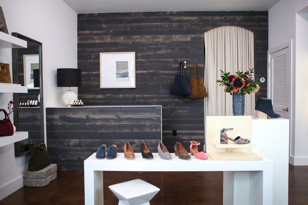
In imagining and designing the first iteration of the 12 South flagship, the client experience was always top of mind, and over a year later, that focus has not changed. Initially, we faced the challenge of a formerly residential floor plan, and with our recent renovation, we think we finally got it right.
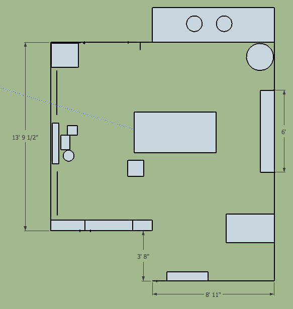
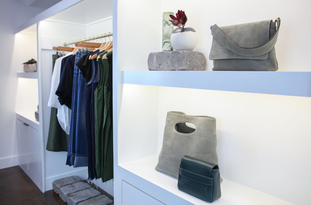
You may remember the long stretch of built-in shelves that were on the right wall as you walked in the front door, followed by a hallway leading backward to our fitting room and offices. In the center of the shop was a grouping of plinths for displaying various products and seasonal wares, and the back wall behind the sales desk was covered in dark wood paneling. All of these interior design elements fulfilled important functions at one time, but eventually we began to notice that the flow of the visitor path was not working anymore and wanted to solve this deceptively simple problem.
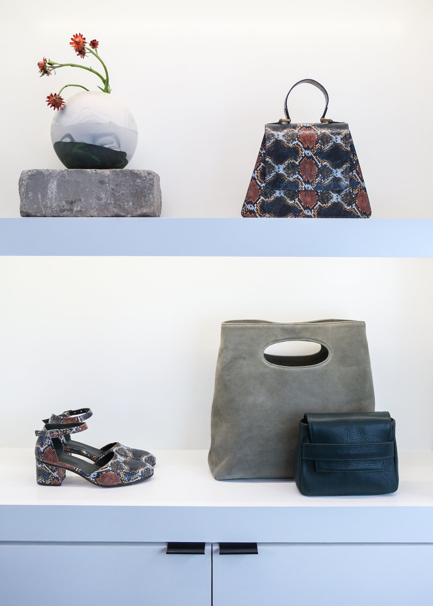
We took some time to really consider a plan for renovation and talked to a contractor friend. We just weren’t sure if such small tweaks would really make that big of a difference. I mean, when you’re working with a few hundred square feet, changing the width or depth even slightly can alter the look and feel of a room dramatically…or not. With space, it’s just as much about perception as reality, and it’s hard to know exactly what you’ve gotten yourself into until it’s already in process or done.

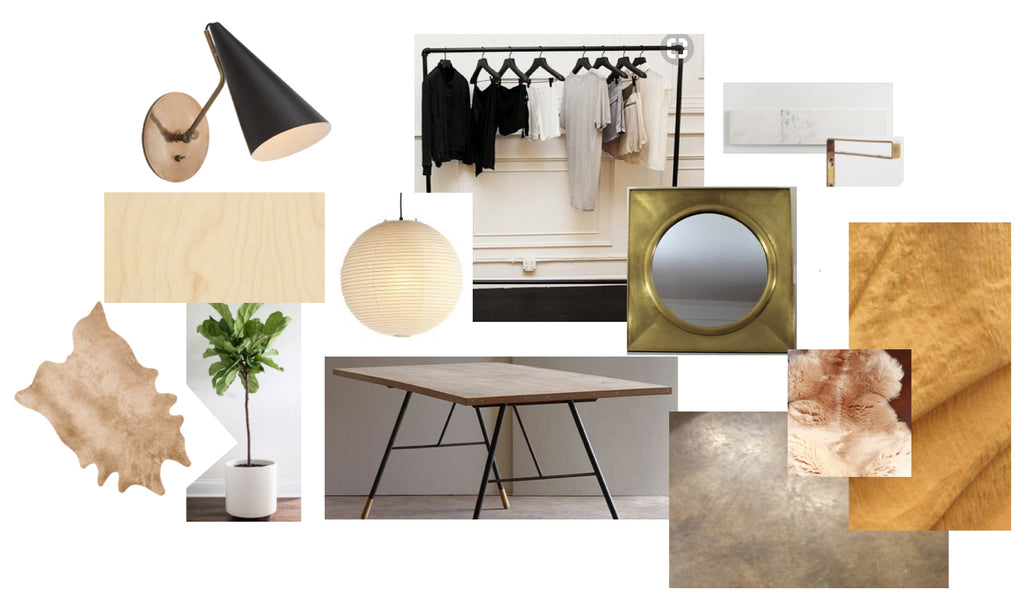
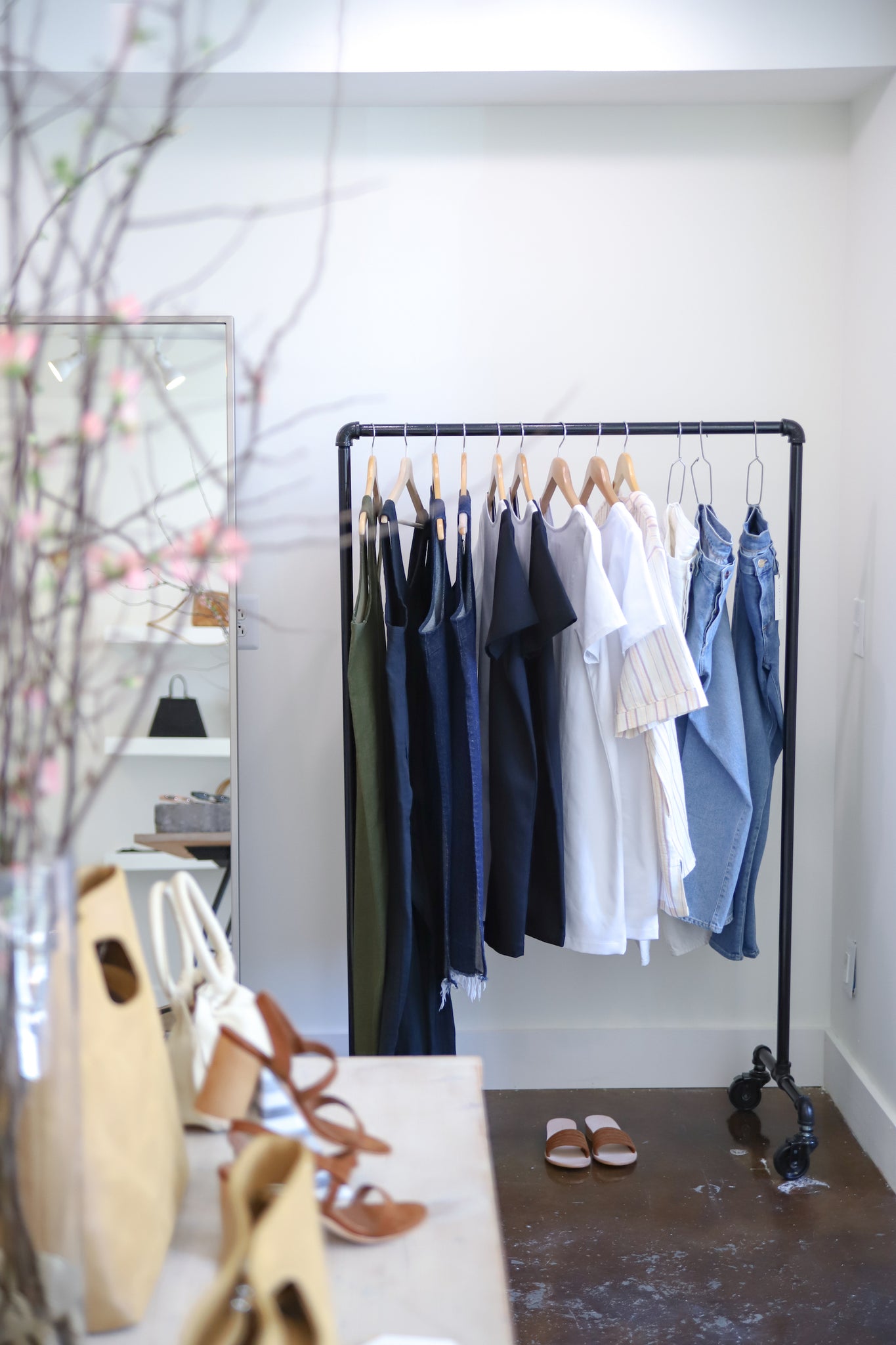
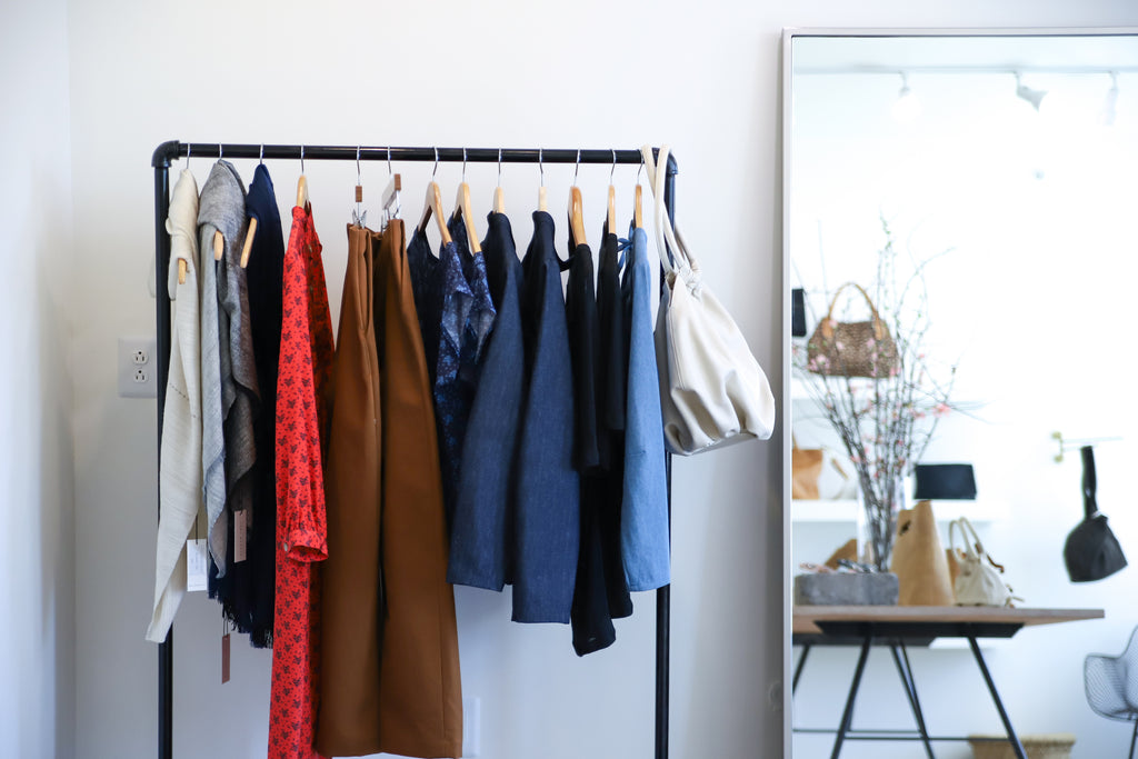
But oh the difference! I can honestly say now, in hindsight, that this renovation is one of the best creative decisions I’ve ever made. We took out the built-ins on the right wall, effectively adding a couple of extra feet to the width of the room. In their place, we added two black, industrial-style garment racks, which flank a full-length mirror—a combo that opens up the space beyond my dreams.
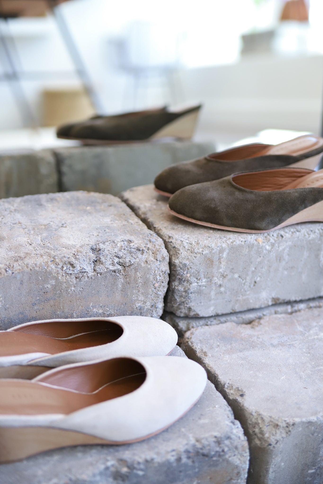
In front of the hallway, we inserted a short wall that extends toward the sales desk and features four oak-stained wood shelves for pieces from the most recent collection. This product is the first thing you see when you walk in the shop, instead of a dark, empty hallway. In the center of the shop now is a soft jute rug and a single flat table, easy for touching and exploring jewelry, candles, and other smalls on top.
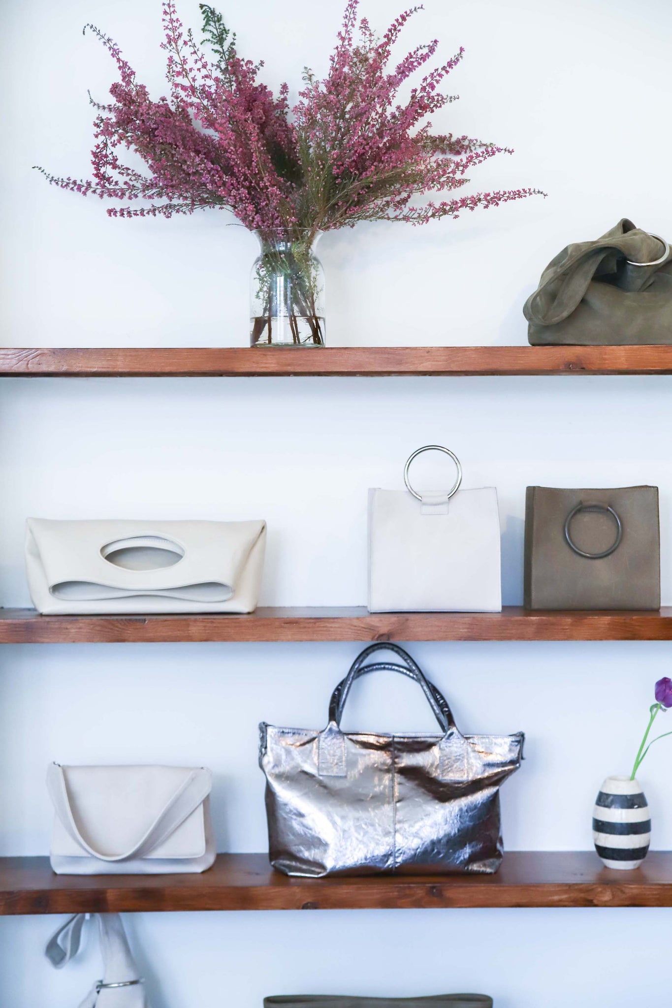
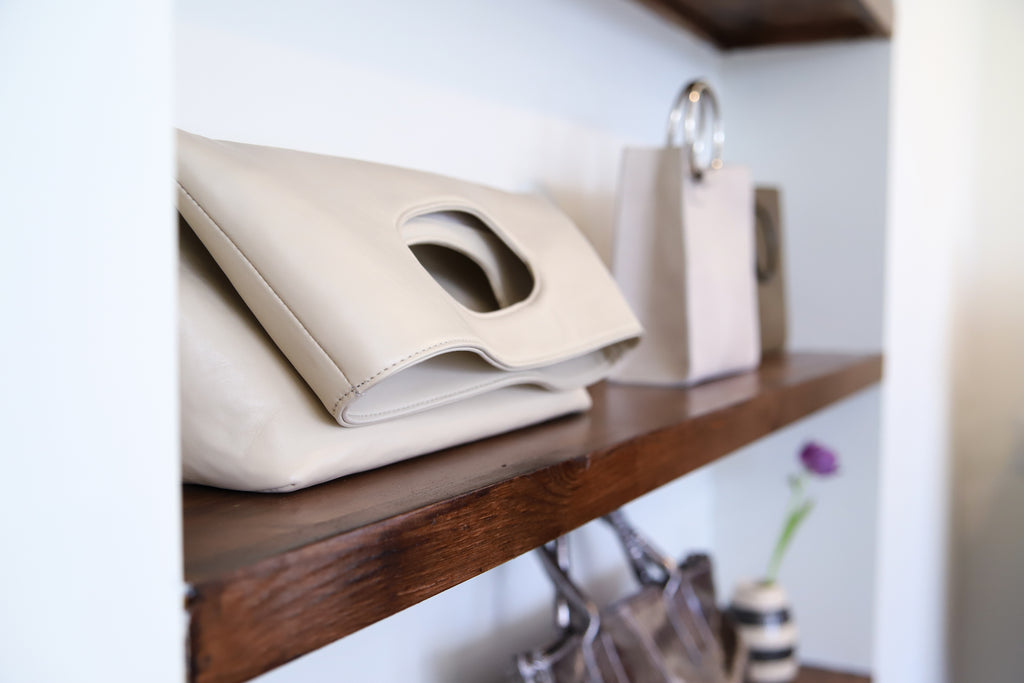
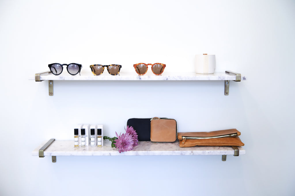
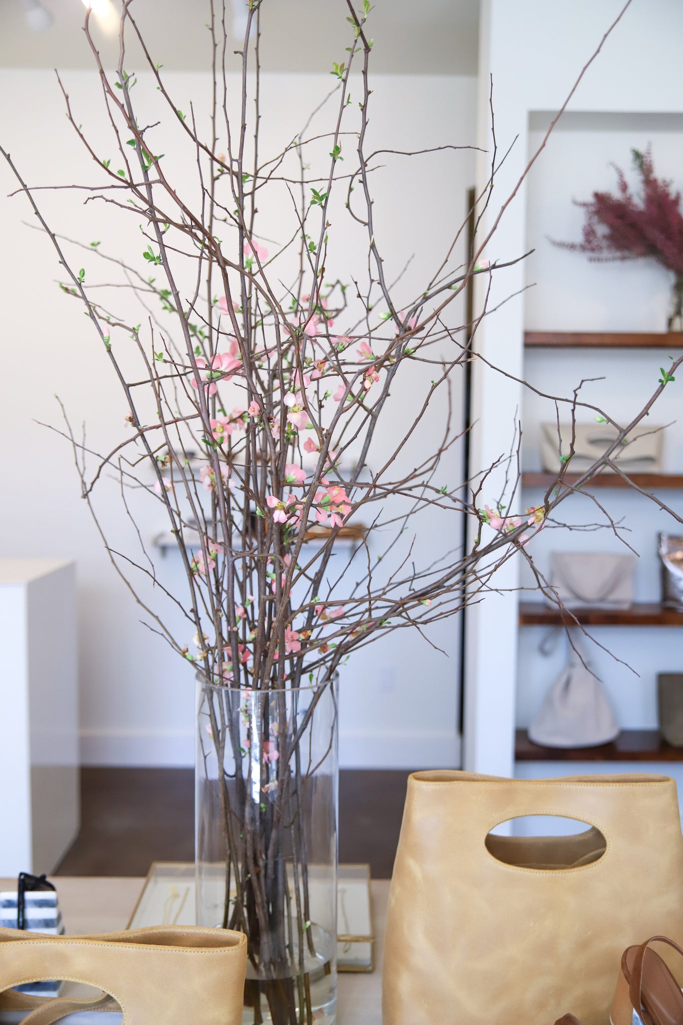
The back wall is now white, reflecting the natural light from the front window and awaiting a fabulous piece of art. Other small additions include two marble shelves for fragrances and sunglasses near the sales desk, flowering plants in colors complementing our SS18 samples, a simplified window display, and extra track lighting throughout for an overall brighten up.
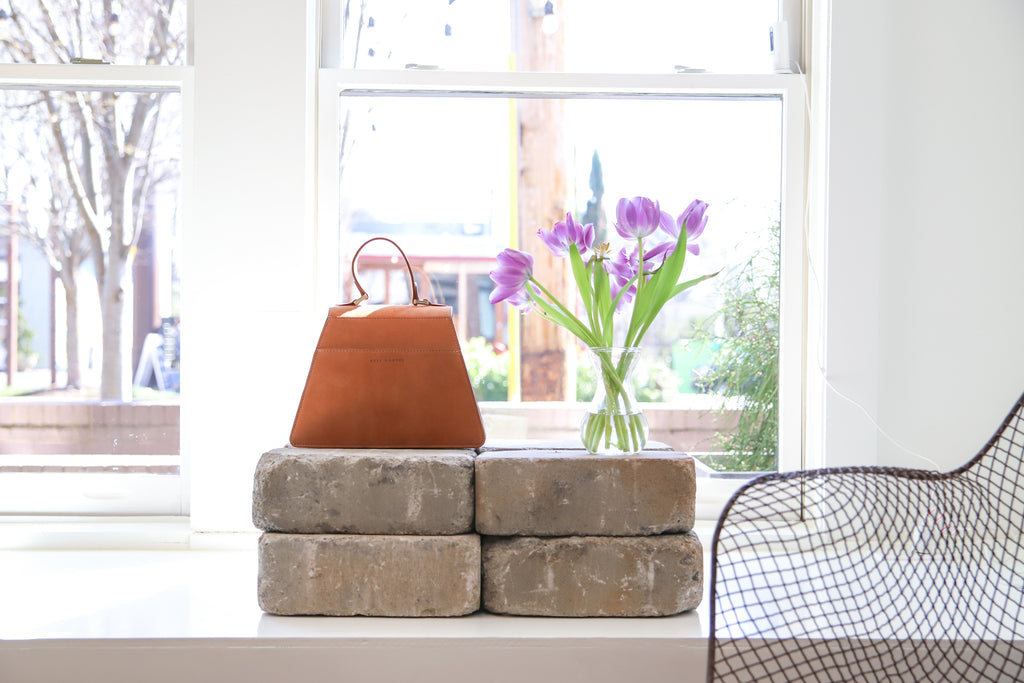
While the renovation is material-based—a mere swap of surfaces and textures, I can’t help but see how much life and movement it has given our brand on an emotional level. Perfect timing for the SS18 launch, I must say.
We’re thankful for a space with the capacity to grow and change with us. We love our clients, we love our community, and we love our neighbors. We look forward to being a small part of your lives for many seasons to come.
We think in person is usually best. Please come see us and the newly renovated flagship on your next trip to 12 South.

